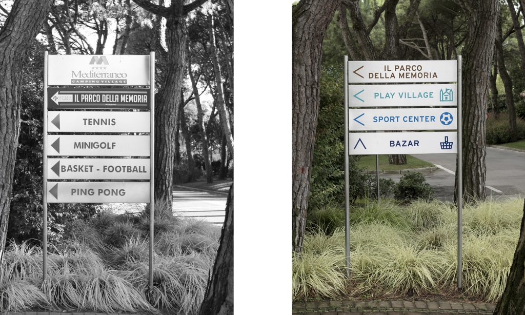
Distribution of content
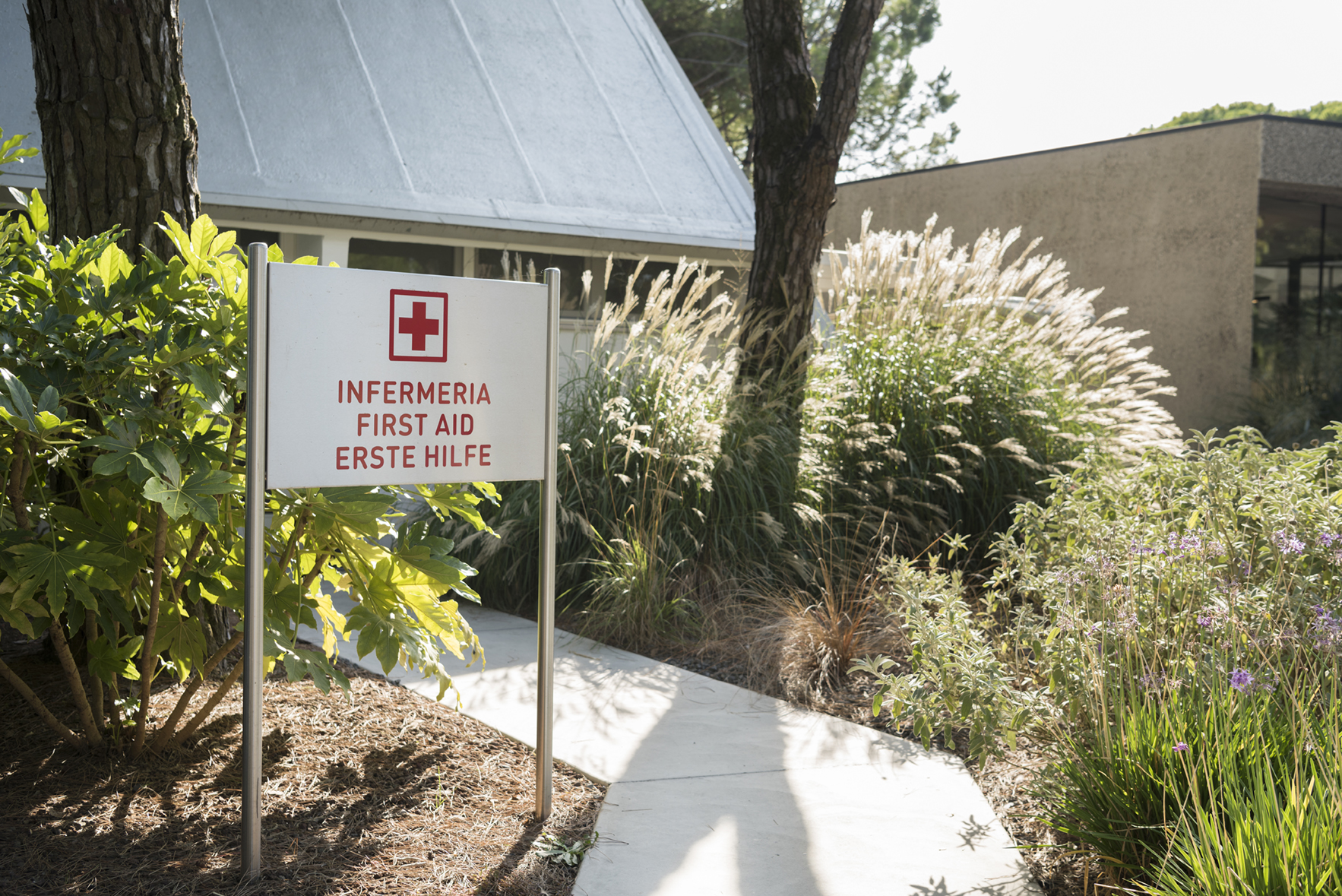
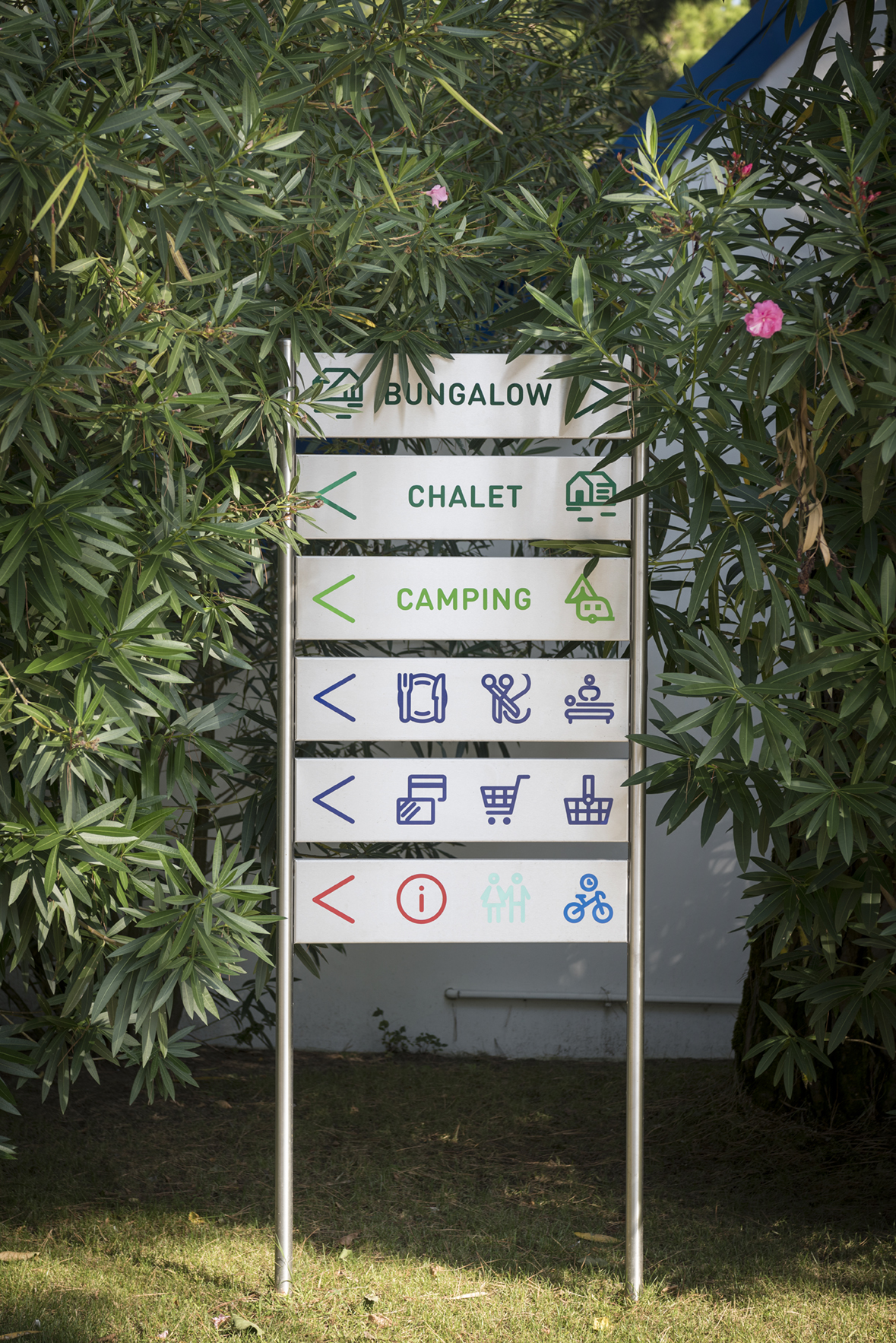
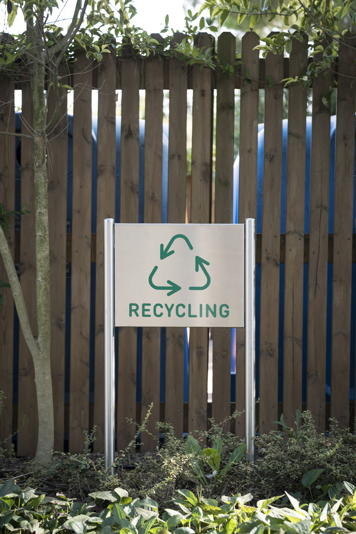
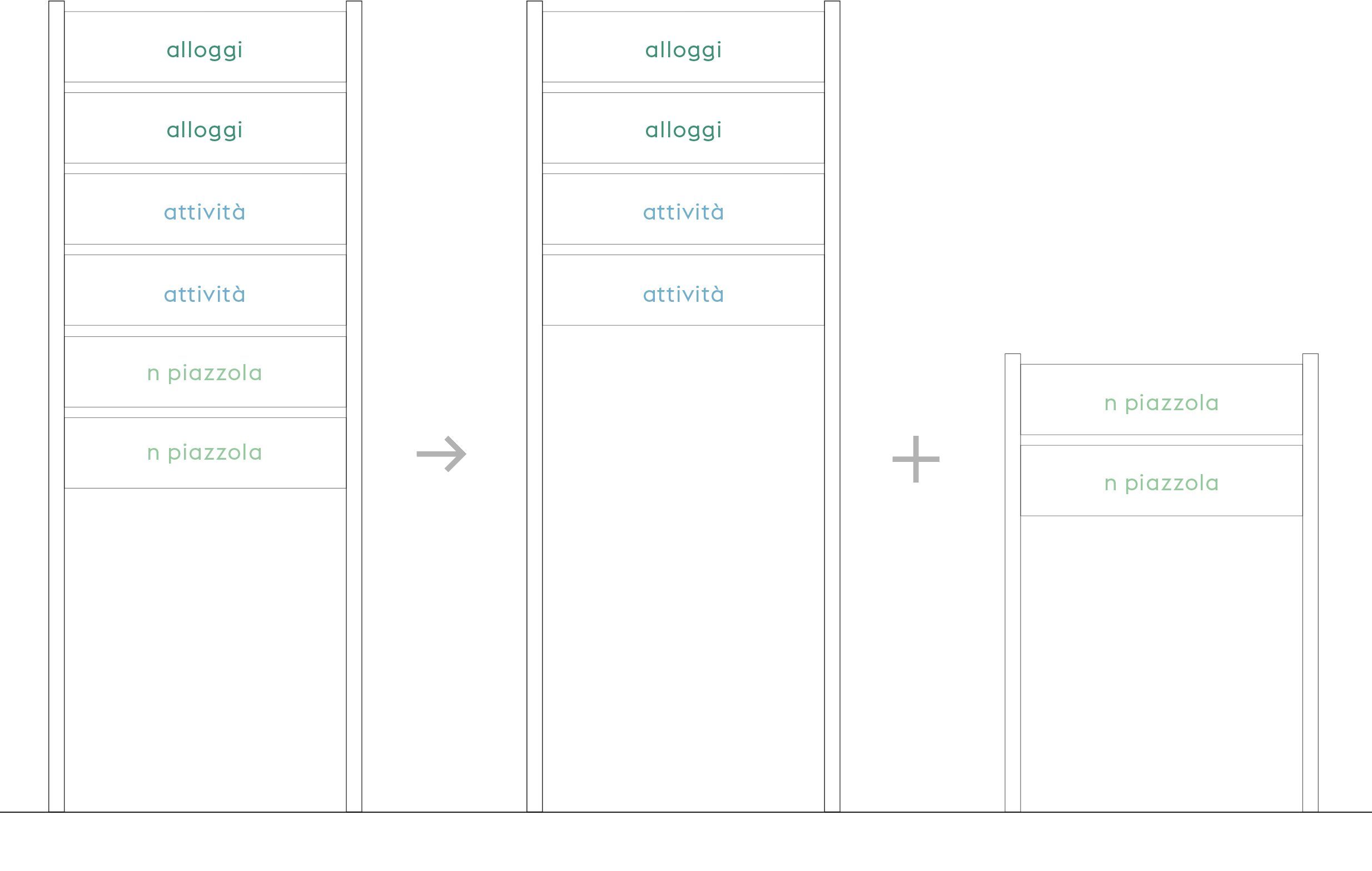
The distribution of content within the media has been divided by hierarchy levels, standardizing the heights of the signs based on the content:
_ service types > tall panels
_ n ° pitch > low panels.
The association of texts and icons has also been regulated for immediate retrieval of the information sought by users.
Typography and icons
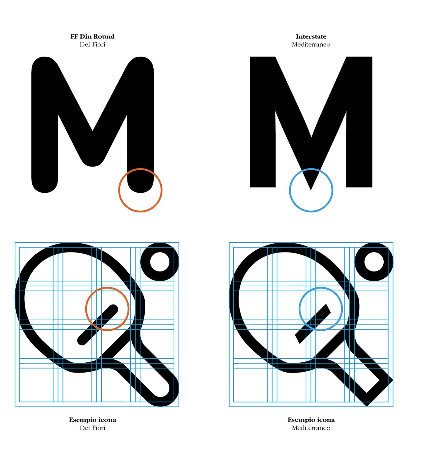
The icon systems of the two campsites are distinguished by
the drawing of the terminal sections:
rounded for Camping Dei Fiori, pointed for the Mediterranean.
This peculiarity characterizes the design of the two institutional characters chosen to accompany the icons in the signage system: the Din Round for the Fiori and the Interstate for the Mediterranean.
